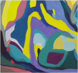
For all of this year, I have been hidden away in my studio - exploring my painting style and fascination with colour . Close by, this quote by Josef Albers is tacked to my wall -
" Art is revelation instead of information, expression instead of description, creation instead of imitation or repetition. Art is concerned with HOW, not the WHAT, not with literal content, but with the performance of the factual content. The performance - how it is done - that is the content of art."
So , who was Josef Albers and why is he front and centre in my current art practice?
Albers is often described as " the square man" in the art world. In the last "25" years of his life, he created over 1000 paintings and prints which he entitled " Homages to the Square". He called this work ' platters to serve colour". The work was his passionate exploration of how colours change according to their positions in relation to their surrounding colours.
But let me step back and provide you with a very brief summation of Albers key life events from an art perspective -
- Born 1888 Bottrop , Germany , he was ultimately known as a renowned American artist and educator
- Bauhaus artist /teacher [ google the significance of the Bauhaus within the art world] ; along with Wassily Kandinsky - both were exiled from Germany when the school was forced to close in the early 1930's
- It is posited that Albers became one of two major art teachers in America - first teaching at Black Mountain College, North Carolina [ Hans Hofmann the other notable teacher during this period ] , later at Yale University
- At various times in his life , he worked in glass, painting, drawing, printmaking, furniture design and poetry writing
- He is considered in many ways to be a pioneer in abstract art and a great art theorist
This year is a milestone in the history of Colour Theory. It is now 50 years since Alber's book " Interaction of Color" was initially published . The 50th Anniversary Edition is available for artists and colour junkies alike who want to advance their understanding of colour and colour theory .
If you are an art student reading this , you will recall the many studies of colour , colour mixing, and other colour studies you may have practiced in school. Many of these exercises were developed from Alber's colour theories and ideas. For Albers, the key principle concerned the relationship between colour, form and space. He wanted his students to " see" , to recognize that a particular colour - say red, changes according to the colours that surround it . The interaction of colours create differing psychological and emotional reactions. And, even more significant, everything depends upon individual perception - what I see is not what you will see; how I react is not how you will react. As a teacher , he threw out a lot of the then methods of teaching art, and pushed his students to experiment - to try putting colours they "disliked" together..... to develop their own emotional connections to what they painted. For Albers, he wanted his students to focus such that " An element plus an element must yield at least one interesting relationship over and above the sum of those elements". For Albers, and now as I paint, each solid area of colour pigment must result in a " kernel of energy".
Albers said to his students that " a change of colors transforms both the emotional character and the apparent physical action of forms". He showed through his colour forms and studies that perception of colour and truth are not the same. This is due to colour superiority. This colour theory was proven out in his series of about 100 paintings he entitled " Adobes" or " Variants". In these paintings his forms remained constant or were only slightly altered, but the colours were changed radically .
COLOUR HIEROGLYPHICS
I have loved exploring the theory of colour and how colours interact since my first art class. Colour interacting with form on canvas is a higher level of study. Colour and form in a spatial context adds yet another layer of complexity . The emotional reaction to colours is personal to every viewer. Look at every artist's work you love. What colours do they use? How do they use them ? What is your emotional reaction to those colours?
As an artist I totally get the idea that Albers spent 25 years painting colours in squares . As I look at various of these squares I am personally fascinated at how I react [ or don't ] to each one. My current work is to experiment with colour interactions in form . I have titled these " colour hieroglyphics" as they are the creation of my personal language in paint. What do you think ?
Some reference for follow up if you are interested-[ geared to artists I think ]
1.Josef Albers - Interaction of Color , 50th Anniversay Edition
2. The Josef & Anni Albers Foundation, located in Bethany, Connecticut.
3. Google images of " Homages to the Square"
Footnote: Colour is the Canadian spelling: colour is the American spelling .....

 RSS Feed