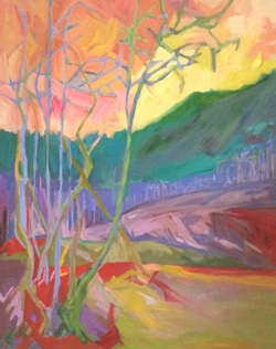
I think I am in trouble. Last blog I walked you through my initial process . Now here I am after my latest efforts in my studio.
My current mood is to avoid blue skies so I added the sky first . Oranges to pinks to yellows and neutrals.
Next I gently added blue /greys and green to the trees.
I haven't used an intense green for awhile so the hills are intensely green to blue and the trees on the ridge are also blues. to violets.
I play with the colour in the foreground not knowing what I really want to do. I want to focus the eye on the left front where the trees hug each other and then have the eye move up the line to to the incline, and the hills beyond . A rule of thumb would be to put the most contrast here [ light to dark and also intensity of colour]. I haven't figured out how I want to do that yet . But the deep red/orange is certainly a standout . [ Do I keep it ?]
BUT, I do not have any cohesion or balance among the various elements yet ..... and as is a consistent problem, too many colours not merging with each other [ complimentary red/green; complementary orange /blue but now can I make them them work together?]
I have always had an issue with values - I need to move to mid-values here ..... [ 60% mid, 10 -15% dark, 10-20% light] ; 30% greys? I also need to focus on where to put the energy in my brushstrokes..... so here I am at the danger point . Will I destroy this work in my next steps or will it survive and thrive ?
I need to set this work on my mantle and look at it for a long time before I put down another brushstroke. As always , I love to hear your thoughts ...... to be continued.
 RSS Feed